Using components
We provide a few custom components that you can use inside documents.
To import a component, use an import statement from the component's description.
Put the import on the top of a document, right before the main heading, and after doc metadata.
---
...
hide_title: true
---

{/* PUT IMPORTS HERE */}

# The document heading
Here's the list of our custom components.
Image
Extended image component.
Importing:
import Image from '@site-comps/Image';
| pub | src | (required) image source, just like <img> HTML tag. |
| pub | border | Whether to add full page width border around image (default: false) |
| pub | center | Whether to center the image |
| pub | desc | A centered description displayed below the image |
| pub | minwidth | A convenient way to specify minWidth of the image." |
| pub | width | A convenient way to specify width of the image." |
| pub | maxwidth | A convenient way to specify maxWidth of the image." |
| pub | minheight | A convenient way to specify minHeight of the image." |
| pub | height | A convenient way to specify height of the image." |
| pub | maxheight | A convenient way to specify maxHeight of the image." |
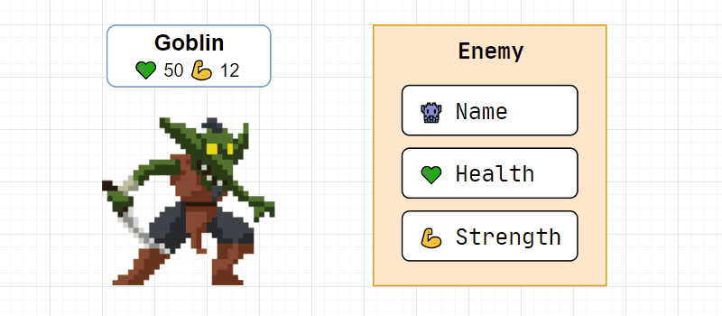
<Image center border
		maxheight={200}
		alt="Goblin enemy presentation"
		src="/img/tutorials/course/basic/structures/GoblinEnemy.gif"
		desc={<>Goblin image by <a href="https://luizmelo.itch.io/monsters-creatures-fantasy">LuizMelo</a></>}
	/>
Result:
Columns
Splits children into columns.
Importing:
import Columns from '@site-comps/Columns';
| pub | columns | (required) CSS column widths (array), see example below. |
<Columns columns={["8fr", "4fr"]}>
	<div>Contents of column 1</div>
	<div>Contents of column 2</div>
</Columns>
Columns component are often used to display code alongside its result.
You can use a prepared "coderesult" snippet I've put in .vscode-template.
Known issues:
- column widths are not responsive
CustomCodeBlock
Adds additional functionality to markdown code blocks.
Importing:
import CustomCodeBlock from '@site-comps/CustomCodeBlock';
| pub | maxLines | Number of lines that when exceeded, causes a vertical scrollbar to appear. |
| pub | resizable | Whether user should be able to resize code block |
Changelog:
- Removed
lineNumbers- Docusaurus now natively supportsshowLineNumbersin Markdown code block
Known issues:
- user can resize beyond the height of the code block
GoogleSlides
Embeds a Google Slides presentation.
Importing:
import GoogleSlides from '@site-comps/GoogleSlides';
| pub | src | (required) The source of a Google Slides presentation (cut after /embed) |
| pub | aspectRatio | A number that describes width : height ratio (default: 16 / 9) |
| pub | delay | Interval between automatic slide changes (milliseconds) |
| pub | autoStart | Whether to start the presentation after page load (default: true) |
| pub | loop | Whether to loop the presentation (default: true) |
| pub | fullWidth | Whether to use 100% (true) of page width or 80% (false) (default: false) |
Example:
<GoogleSlides
		src="https://docs.google.com/presentation/d/e/2PACX-1vTsdQPMXKN90rcz4i515JK-rpUHjHTc5xIjGVtNJS8XSbloMNObHEBUSszvYi9I7tuKBNIdEKNFh1jk/embed"
		aspectRatio={960 / 500}
		delay={500}
		centered
	/>
Result:
SymbolTable
A table that is used to document symbols and properties.
Importing:
import SymbolTable, { Symbol } from '@site-comps/SymbolTable';
SymbolTable fields
| pub | noTraits | Whether to hide the left-most column with symbol traits (const, static, etc.) |
Symbol fields
| pub | name | (required) Name of the symbol |
| pub | desc | Description of the symbol. You can also specify it as a children: uwaga Due to rules of MDX formatter, if you want to use Markdown elements inside the JSX element, you have to remove the indentation, otherwise it will be recognized as a code block. |
| pub | autoLink | Auto-generate the link |
| pub | link | Custom link |
| pub | linkName | URL-compliant name used when autoLink=true |
Symbol trait fields:
| pub | pub | Adds a "public" trait to the symbol |
| pub | priv | Adds a "private" trait to the symbol |
| pub | prot | Adds a "protected" trait to the symbol |
| pub | volatile | Adds a "volatile" trait to the symbol |
| pub | const | Adds a "const" trait to the symbol |
| pub | constexpr | Adds a "constexpr" trait to the symbol |
| pub | virtual | Adds a "virtual" trait to the symbol |
| pub | static | Adds a "static" trait to the symbol |
ClassSummary
Importing:
import ClassSummary from "@site-comps/ClassSummary";
Usage:
import ClassSummary from '@site-comps/ClassSummary';
import SymbolTable, { Symbol } from '@site-comps/SymbolTable';
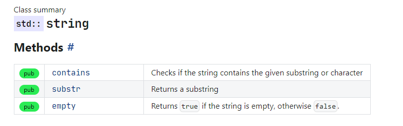
<ClassSummary name="string" namespaces="std">
### Methods
<SymbolTable>
<Symbol pub autoLink name="contains" desc="Checks if the string contains the given substring or character"/>
<Symbol pub autoLink name="substr" desc="Returns a substring"/>
<Symbol pub autoLink name="empty">
Returns <code>true</code> if the string is empty, otherwise <code>false</code>.
</Symbol>
</SymbolTable>
</ClassSummary>
Result:
ClassSummary Fields
| pub | name | (required) The name of the class |
| pub | namespaces | A string, or a list of namespaces, for example:namespaces="std" or namespaces={["std", "chrono"]} |
ProductCard
Importing:
import ProductCard from '@site-comps/ProductCard';
Usage:
<ProductCard title="Visual Studio Code" author="Microsoft" img="/img/icons/products/vscode_1_35.svg" rating={9}>
	<ProductCard.Desc>
		A powerful tool with everything you need, including a code editor
		and a compiler that supports the latest C++20 standard.
		<ProductCard.Details>
			<h3>Pros</h3>
			<ul>
				<li>All in one</li>
				<li>Simple installation and configuration</li>
				<li>Access to the latest C++20 standard</li>
				<li>The best debugger available</li>
			</ul>
			<h3>Cons</h3>
			<ul>
				<li>Relatively big installation size (download ~2 GB, after installation ~7 GB)</li>
				<li>Not portable</li>
				<li>Windows only</li>
			</ul>
		</ProductCard.Details>
	</ProductCard.Desc>
	<ProductCard.Actions>
		<a href="https://code.visualstudio.com">Product website</a>
	</ProductCard.Actions>
</ProductCard>
Result:
Visual Studio Code
A powerful tool with everything you need, including a code editor and a compiler that supports the latest C++20 standard.
Szczegóły
Pros
- All in one
- Simple installation and configuration
- Access to the latest C++20 standard
- The best debugger available
Cons
- Relatively big installation size (download ~2 GB, after installation ~7 GB)
- Not portable
- Windows only
ProductCard Fields
| pub | title | (required) The name of the class |
| pub | img | (required) A string containing an URL of an image, or a SVG element |
| pub | author | The author of the product |
| pub | rating | The rating of the product, showed using 5-stars. Use values between 0 and 10. |
ProductCard.Desc
It is a subcomponent of the ProductCard used to add the product's description.
ProductCard.Actions
It is a subcomponent of the ProductCard used to add actions content to the product.
ProductCard.Details
It is a subcomponent of the ProductCard used to add details to the product's description.
ProductCard.Details is only allowed inside a ProductCard.Desc element.
ToolCard
Importing:
import ToolCard from '@site-comps/ToolsSummary';
TODO: description